Case study · 01
Where talent meets enterprise.
Greenfield website design — built from scratch — for an IT outsourcing firm bridging Middle East & Asia technical talent with global enterprise buyers.
- Year
- 2026
- Client
- JHF IT Innovations
- Role
- UI/UX Designer · Lead
- Scope
- Website (from scratch) · Brand system
Live site · jhf-it.vercel.app/
01
Project Overview
- Project
- JHF IT Innovations — Website
- Duration
- 5 weeks
- Team size
- 2 (Designer + Developer)
- My role
- Lead UI/UX Designer
- Tools
- Figma, Miro, Notion
- Platform
- Responsive Web (B2B)
A greenfield website for a Middle East & Asia IT outsourcing firm — built from a blank canvas to make the brand credible enough for enterprise procurement teams in Riyadh, Dubai and Singapore.
02
Problem Statement
“Enterprise buyers Google JHF, find nothing, and assume they're a freelance shop.”
Who: CTOs and procurement leads at mid-cap MEA enterprises evaluating IT outsourcing vendors.
What: JHF had no website. Every sales conversation had to re-explain positioning, scale and the Cognilearn talent pipeline from zero — losing credibility before the first call.
Why it matters: Without a credible web presence, JHF was being shortlisted at the same tier as one-person freelance teams — capping deal size and lengthening every sales cycle.
03
Business Goal
- 01Shorten the sales cycle by removing the trust-gap at first touch.
- 02Raise average deal size by positioning JHF at enterprise tier, not freelance tier.
- 03Drive two qualified conversion paths in parallel — Book Consultation (procurement) and Explore Solutions (engineering).
- 04Make the Cognilearn talent-pipeline differentiator visible as a top-fold proof point.
04
User Research
Method mix designed for a B2B audience that's hard to recruit directly:
- Stakeholder interviews: working sessions with JHF founders — positioning, values, sales objections.
- Sales call ride-alongs: shadowed live discovery calls with prospective enterprise buyers.
- Competitor teardown: heuristic + content audit of MEA outsourcing sites and reference enterprise brands (IBM, Globant, Endava).
- Desk research: procurement decision criteria for IT outsourcing in MEA markets.
05
Research Insights
- Abuyers scan the homepage for three things — scale, regional focus, and a credible quality signal — and bounce quickly if any are missing.
- Bcompetitors over-index on stock office imagery; none show their actual delivery model. Clear positioning gap.
- Cthe best-performing reference brands use a single confident hero statement, not a feature carousel.
- Dthe most repeated story in sales calls is the Cognilearn talent pipeline — but it lived only in the deck.
06
User Journey Map
STAGE       Discover     Land          Evaluate        Decide         Convert
─────────────────────────────────────────────────────────────────────────────
ACTIONS     Referral     Hits site     Scans hero,     Compares to    Books call
            from peer    from search   stats, proof    competitors    or emails

THOUGHTS    "Worth a     "Will this    "Are they       "Safer than    "Easy
            look?"       look real?"   real scale?"    the others?"   path in"

EMOTION     curious      skeptical    cautious         confident      committed
              ●            ●●           ●●●              ●               ●●

PAIN        too many     generic       no proof of     identical       form too
POINTS      vendors      hero          delivery        positioning     long
The peak emotional friction is at “Evaluate” — where the trust deficit either closes or kills the deal. The redesign loads the credibility lock (stat row + Cognilearn proof) exactly at that scroll position.
07
Define the Opportunity
JHF doesn't need more services on the page. It needs proof — placed exactly where buyers start to doubt.
The opportunity isn't to out-feature competitors; it's to be the only vendor in the category that shows its actual delivery model and talent pipeline above the fold. Everything else (services, case studies, contact) can be flat and discoverable — but the hero + proof anchor has to do the convincing.
08
Ideation Process
Three rounds in Figma + Miro before any pixel-level work:
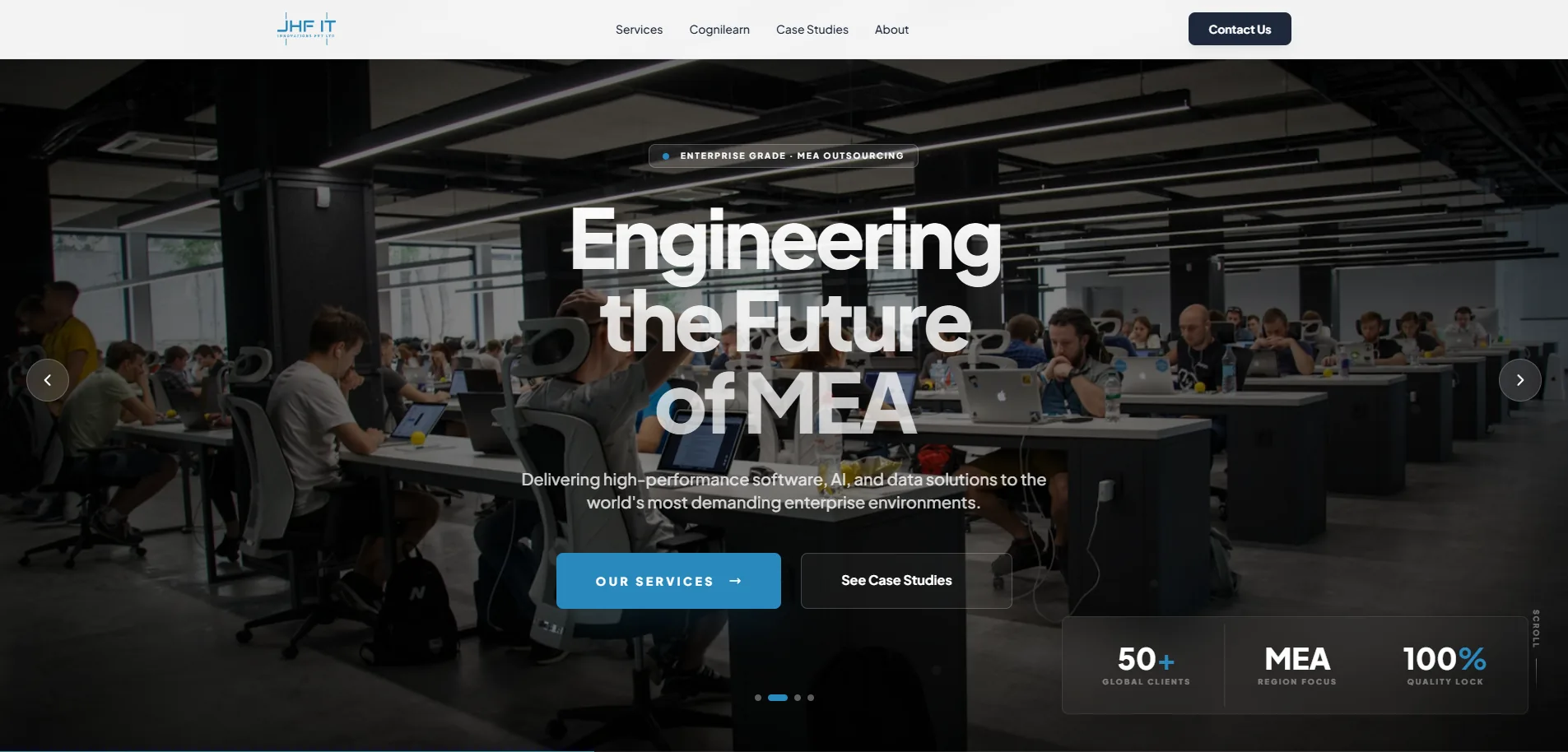
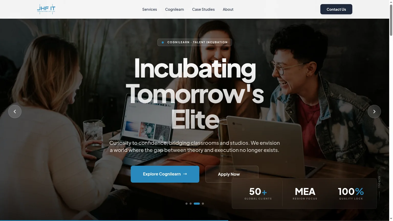
- Crazy 8s on the hero: 8 variations of opening message — static statement, rotating tagline, stat-led hero, video bg, founder quote, regional map, client logos, before/after. Rotating hero won (serves 4 buyer mindsets without a carousel of features).
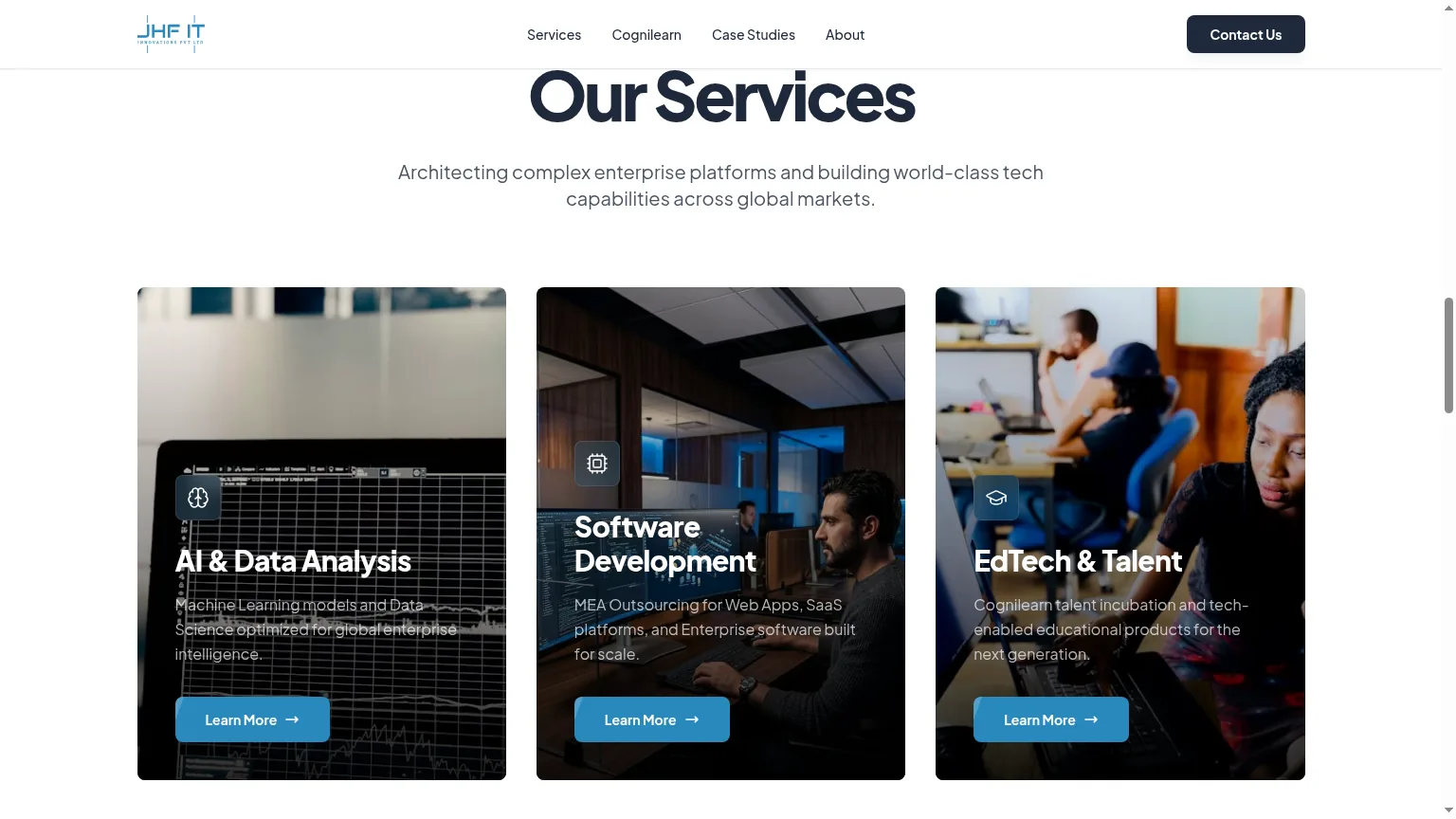
- Feature prioritization (MoSCoW): Must = Hero, Stat anchor, Services, Cognilearn bridge, Dual CTA. Should = Case studies index. Could = Careers. Won't = Blog, testimonials carousel.
- Information architecture: kept flat — 5 top-level routes max. Enterprise buyers don't want to dig.
/                          Home (hero rotation + stat anchor + Cognilearn bridge)
├── /services               Software · AI · Data
├── /case-studies           Selected enterprise deliveries
├── /cognilearn             Talent incubation arm
├── /about                  Company + careers
└── /contact                Lead capture · Book consultation
09
User Flow
Primary procurement flow — designed to reach “Book consultation” in under 90 seconds of scroll.
Landing  →  Hero rotation  →  Stat anchor  →  Cognilearn bridge  →  Dual CTA
   │            (4 messages)     (proof)         (differentiator)
   │
   └──► Services  →  Service detail  →  Contact form  →  Confirmation
                                          (Book / Explore)
10
Wireframes
Built in Figma greyboxes at 3 densities (desktop, tablet, mobile) before any colour or type was applied. Two rounds of greybox review with the founders before visual styling started.
- Lo-fi sketches: hand-drawn 8-frame storyboard of homepage scroll, used to align with founders on narrative order before opening Figma.
- Mid-fi wireframes: hero block (rotating headline + dual CTAs), stat anchor row (4-up desktop / 2×2 mobile), Cognilearn bridge (60/40 image-copy), 3-up service grid.
- Evolution: dropped a planned testimonials carousel after greybox review — competitor research showed it reads as filler. Replaced with a single weighted client-logo strip.
11
Design System
The system is built on five primitives — color, typography, components, grid, and spacing — so any new enterprise page can be assembled without bespoke design work.
01 · Color
Deep midnight navy as the canvas, paper-warm off-white for body (not pure white — clinical), and a single electric blue strictly for CTAs and active states. Gold appears once — on the “100% Quality Lock” stat — as the only chromatic break.
Background
#0A1628
Midnight navy — enterprise without going pure black.
Foreground
#F5F7FA
Off-white paper. Keeps long-form readable.
Primary CTA
#2E7CF6
Single electric blue. Scarcity makes the click obvious.
Metadata
#7A8A9E
Muted slate for eyebrows and stat labels.
Accent (rare)
#D4AF37
Faint gold — used once per page on the Quality Lock stat.
Surface
#1A2942
One step lifted for cards and the contact strip.
02 · Typography
One geometric sans for display (single weight — decisive, not designer-y), Inter for body and UI. Four-step scale: Display, H2, Body, Caption.
Display
Geometric Sans · 600
64/68 · -2%
H2
Geometric Sans · 600
36/42 · -1%
Body
Inter · 400
16/26
Caption / Mono
JetBrains Mono · 500
12/16 · +8%
03 · Components
Five components carry the entire site — Hero, StatRow, ServiceCard, BridgeBlock, DualCTA. Each has a single responsibility and a fixed footprint on the grid.
Primary CTA
Filled blue. One per viewport. Used for Book Consultation only.
Ghost CTA
Outlined. Engineering / Explore Solutions path. Sits beside primary without competing.
100%
Quality lock
StatCard
Hero stat anchor. 4-up desktop, 2×2 mobile. Number leads, label muted.
01 · Software
Custom platforms
Built for the buyer's stack, not ours.
ServiceCard
3-up grid. Eyebrow, title, one-line outcome. No icons — type does the work.
04 · Grid
- Columns
- 12-col desktop · 8-col tablet · 4-col mobile
- Gutter
- 24 / 16 / 16
- Margin
- 96 / 48 / 24
Hero spans 12. Stat row spans 12 in 4-up cells. Service cards span 4 each. BridgeBlock is a deliberate 7/5 split to break the symmetry once per page.
05 · Spacing
Base · 8px rhythm. Section vertical = 96 / 64 / 32 (desktop / tablet / mobile).
12
High Fidelity Designs
Shipped at jhf-it.vercel.app. The client closed two enterprise conversations directly attributed to the redesign within the first month of launch.
Next case
Cognilearn →