Case study · 02
Learn by doing, not by watching.
Full website redesign for Cognilearn — a four-year 'experiencship' model that puts students inside real company workflows instead of classrooms.
- Year
- 2026
- Client
- Cognilearn
- Role
- UI/UX Designer · Lead
- Scope
- Full website redesign · Design system
Live site · cognilearn.org/
01
Project Overview
- Project
- Cognilearn — Website Redesign
- Duration
- 6 weeks
- Team size
- 3 (Designer + 2 Developers)
- My role
- Lead UI/UX Designer
- Tools
- Figma, Miro, Notion
- Platform
- Responsive Web (Ed-tech)
A full website redesign for Cognilearn — a four-year “experiencship” model that puts students inside real company workflows instead of classrooms. Moved the brand from a generic ed-tech catalog feel into a serious editorial product narrative.
02
Problem Statement
“Cognilearn doesn't sell courses, but the old site sold it like one.”
Who: Pre-college students choosing where to spend four years, and college partnership leads evaluating Cognilearn as a curriculum partner.
What: The old site led with course catalogs and feature lists. Cognilearn's actual offer — four years of structured time inside real companies — was buried below the fold.
Why it matters: The mismatch between message and offer hurt both student applications and college-partner credibility. Students couldn't tell what was different; partners couldn't justify the model internally.
03
Business Goal
- 01Increase student application completion rates.
- 02Open the college-partner pipeline by making the experiencship model defensible in 60 seconds of scroll.
- 03Speak to both audiences on one homepage without splitting it into two.
- 04Build a component library reusable across the public site and the future student-side product.
04
User Research
Mixed-method research to understand both the teenager voice and the partner voice:
- Student onboarding sessions: sat in on live calls; tracked which phrases landed and which got blank stares.
- Founder interviews: working sessions on the “experiencship” glossary — a coined word that the design has to make feel earned.
- Competitor teardown: ed-tech sites across Coursera, Masai, Newton, Scaler, NextLeap and regional players — hero patterns, IA, pricing presentation.
- Content audit: existing marketing material, curriculum docs, and the old site's analytics.
05
Research Insights
- Aevery competitor scanned led with course catalogs — none led with outcomes, leaving open space at the top of the funnel.
- Bstudents give a site a short window before deciding it's “another learning platform.” The hero has to make the difference visible immediately.
- Cboth audiences (student + partner) can coexist on one page if it's chaptered — student-friendly pace up top, partner-grade depth lower down.
- Done word — “experiencship” — does the heaviest brand lifting. Typography and accent colour have to make it feel earned, not gimmicky.
06
User Journey Map
STAGE      Discover     Land            Understand      Compare         Apply
─────────────────────────────────────────────────────────────────────────────
ACTIONS    Reel / ad    Hits hero       Scrolls         Opens Tracks    Application
                                        chapters        page            flow

THOUGHTS   "Looks       "Wait, what     "Okay this is   "Better than    "Hope the
           different"   is this?"       different"      Scaler?"        form is short"

EMOTION    curious      attentive       convinced       confident       committed
             ●            ●●              ●●●             ●●●             ●●

PAIN       short        unclear         long copy       8 domains       long form
POINTS     attention    pitch           on landing      to compare      (next iter)
Friction peaks at “Land” (unclear pitch) and “Apply” (long form). The redesign solves the first with a verb-led hero; the second is logged for the next round as a 3-step conversational split.
07
Define the Opportunity
Students don't need more courses. They need a way to see, in 10 seconds, that this isn't another course.
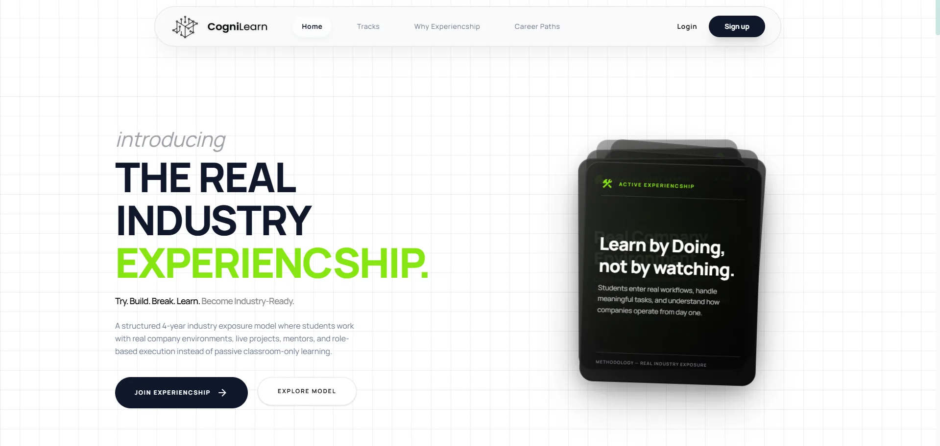
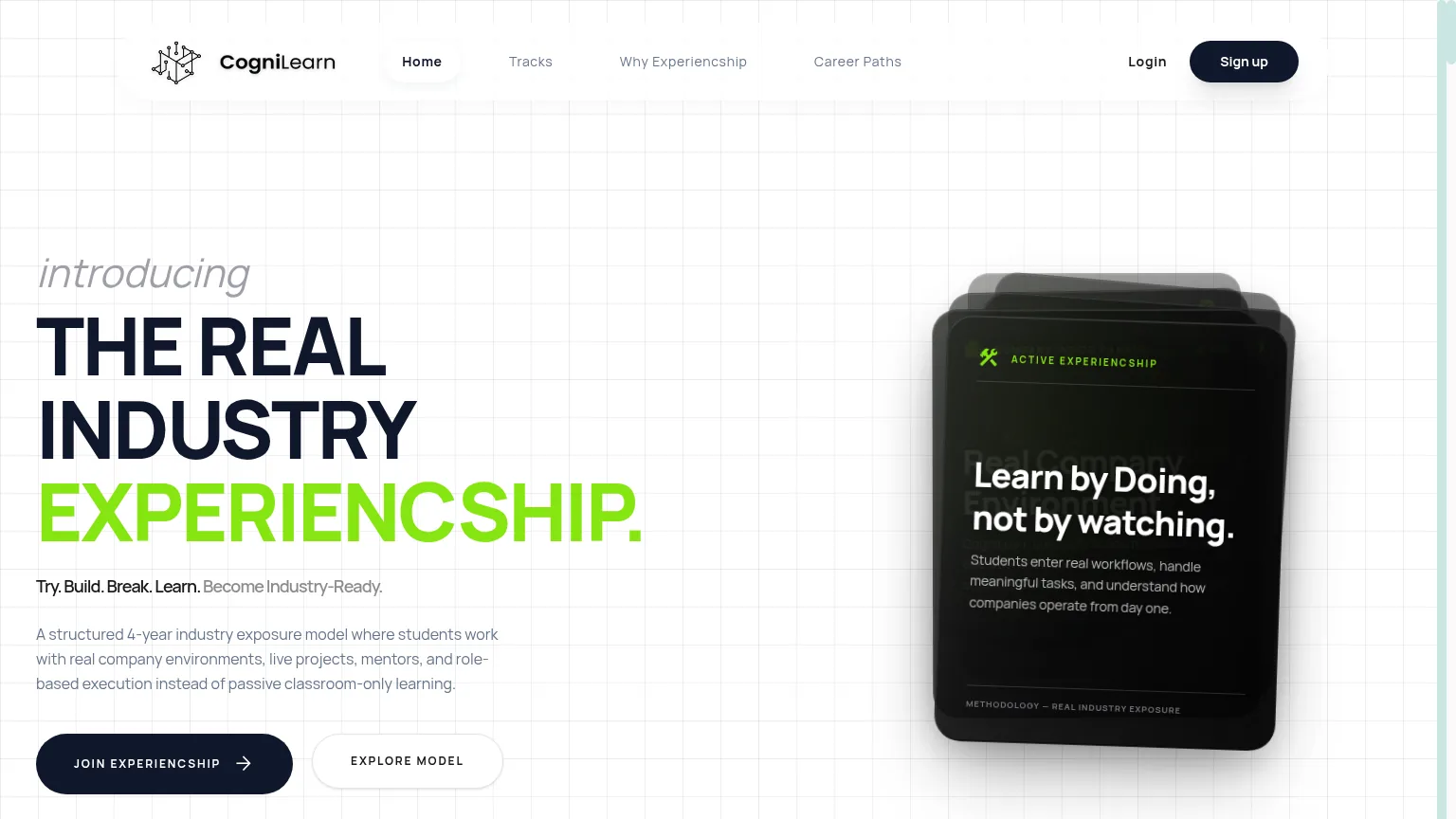
The opportunity is to reframe the hero from feature-list to verb — “Learn by doing, not by watching.” — and let the rest of the page earn that claim with structured chapters. Picking a non-default accent colour (lime over the expected ed-tech blue) signals voltage instead of safety and makes the brand visually distinct in the category.
08
Ideation Process
Three rounds of structured thinking before any polished UI:
- Crazy 8s on the hero: 8 opening lines tested — chosen was the 3-line cascade “introducing → THE REAL INDUSTRY → EXPERIENCSHIP.” because it earns the word through rhythm.
- Feature prioritization (MoSCoW): Must = Hero, Experiencship model, Domains, Career paths, Apply CTA. Should = Why Experiencship long-form. Could = Alumni stories. Won't = Blog, course catalog.
- Information architecture: chaptered homepage + 3 deep routes for sales/signup path.
/                          Home — chaptered scroll
├── 01 Experiencship Model
├── 02 Industry Exposure
├── 03 Domains
├── 04 Career Paths
└── 05 Apply

/tracks                    Eight domain detail pages
/why-experiencship         Long-form for college partners
/career-paths              Outcomes & alumni
/signup                    Application flow
09
User Flow
Primary student flow — reach “Apply” in five clear chapters.
Home (chaptered scroll)
  │
  ├── 01 Experiencship Model
  ├── 02 Industry Exposure
  ├── 03 Domains  ──────────► /tracks (8 domain detail pages)
  ├── 04 Career Paths ──────► /career-paths (outcomes + alumni)
  └── 05 Apply  ────────────► /signup (application flow)

Partner branch:
Home  ──────────────────────► /why-experiencship (long-form pitch)
10
Wireframes
Greybox wireframes in Figma at desktop / tablet / mobile before any colour or type was applied. Five components carry the entire homepage.
- Lo-fi: 6-frame scroll storyboard, hand-sketched, to lock chapter order with founders.
- Mid-fi: hero block (display verb left, floating device mock right), sticky chapter index, 4×2 domain grid, oversized outcome stat, full-width application CTA band.
- Evolution: dropped a planned testimonials slider after greybox review — replaced with a single outcome stat per section. Numbers convert better than carousels for this audience.
11
Design System
Built on five primitives — color, typography, components, grid, spacing — so the homepage, the eight domain pages, and the future student product can all share the same library.
01 · Color
Ed-tech defaults to blue. Cognilearn isn't a course platform — it's a verb. Paper-white canvas, deep ink for editorial readability, then one electric lime as the “experiencship” accent. Lime instead of green: green reads safety/wellness; lime reads voltage. Used once per chapter — never twice.
Background
#FAFAFA
Paper white, slightly warm. Long-form scroll without glare.
Ink
#0B1220
Deep blue-black instead of true black. Pairs softer with the lime.
Experiencship lime
#C6FF3D
The one accent. Highlights the word and primary CTAs only.
Card slate
#1F2937
Dark surface for device-mock card. Lifts lime mock screens.
Rule grey
#6B7280
Hairlines, captions, chapter numbers.
Grid
#E5E7EB
Blueprint grid at 4% opacity. The structure metaphor.
02 · Typography
Display sans at extreme weight for headlines — architectural, not decorative. Humanist sans for body. Mono for chapter numbers and captions, to reinforce the “structured 4-year model” metaphor.
Display
Grotesk · 800
72/72 · -3%
H2
Grotesk · 700
40/44 · -2%
Body
Humanist Sans · 400
17/28
Chapter / Mono
JetBrains Mono · 500
12/16 · +10%
03 · Components
Five components carry the homepage: HeroCascade, ChapterIndex, DomainCard, OutcomeStat, ApplyBand. Each owns one job, on one grid.
Primary CTA
Lime fill on ink. One per chapter. Used for Apply only.
- 01 · Model
- 02 · Industry
- 03 · Domains
Chapter index
Sticky left rail. Mono number + label. Active = lime underline.
Product Design
SaaS · Mobile
DomainCard
4×2 grid. Icon-free. Title + 2 outcome tags.
94%
Placed within 6 mo
OutcomeStat
Oversized numeral, mono label. Replaces testimonial sliders.
04 · Grid
- Columns
- 12-col desktop · 8-col tablet · 4-col mobile
- Gutter
- 32 / 24 / 16
- Margin
- 120 / 64 / 24
A 4% opacity blueprint grid sits behind the whole site — the metaphor for a structured 4-year model, made visible without ever being mentioned. Hero verb spans 10/12; chapter index occupies a sticky 2/12 rail.
05 · Spacing
Base · 8px rhythm. Chapter vertical = 160 / 96 / 48 (desktop / tablet / mobile).
12
High Fidelity Designs
Shipped at cognilearn.org. The site became the primary sales tool for both college outreach and student applications.
Next case
JHF IT Innovations →